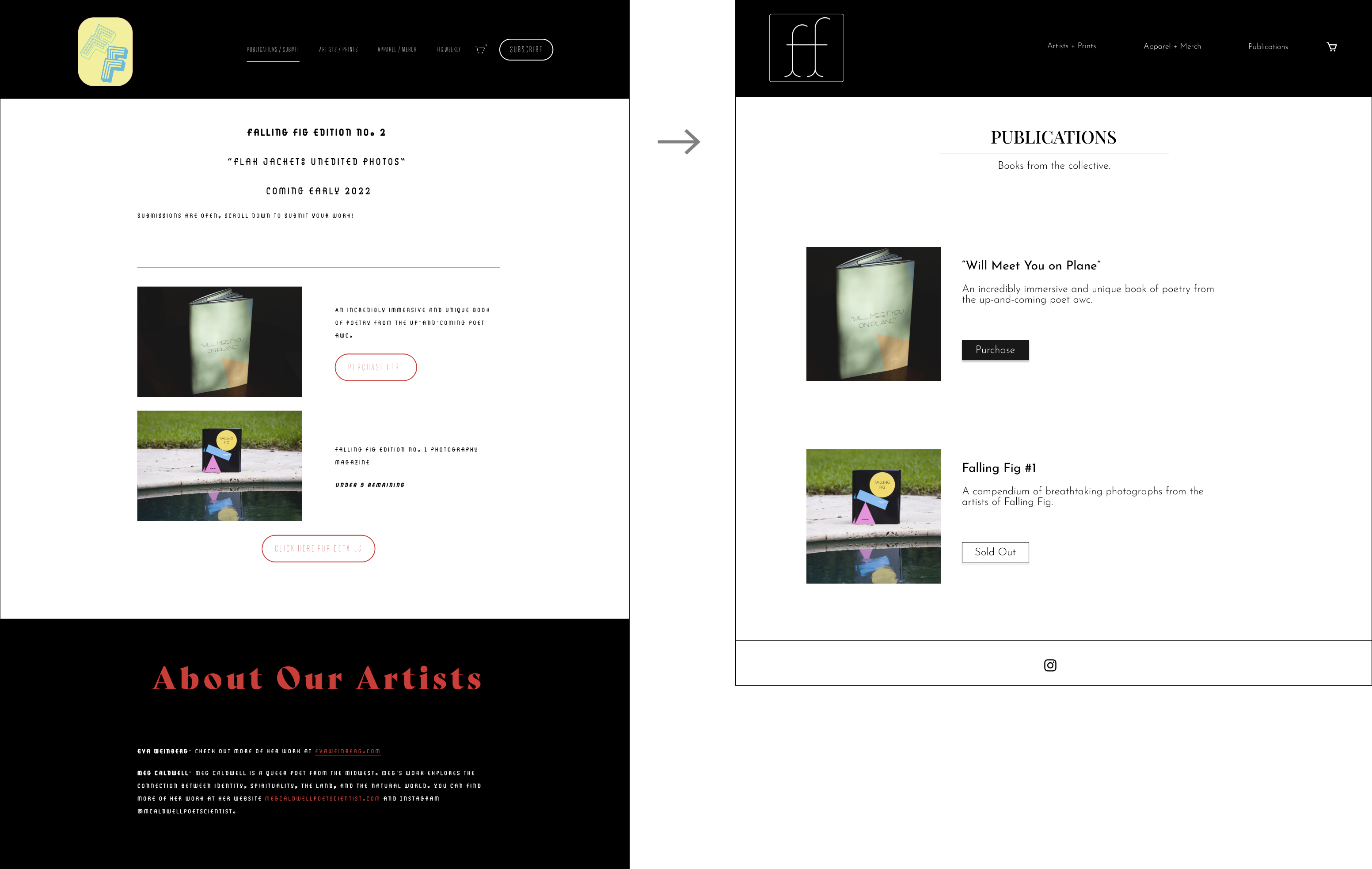
Paul Josel

 Client
Falling Fig

Scope
 UX Research | Visual Design | Content Writing

  Team
Paul Josel                UX Designer

Overview

Falling Fig is a newly launched magazine, print shop, and online gallery created by a group of photographers and poets to showcase and sell their work. In order to increase user interactions and sales, they hired me to enhance their online. This required identifying pain points on the site through user research, synthesizing those results into actionable insights, and using those insights to improve the overall legibility, navigation, and look and feel of the site.

Goals

I discussed the current state of the website with the founders of Falling Fig and made a list of the desired outcomes for the redesign.

Business Goals
  • Reinvigorate the aesthetic of the website
  • Increase web traffic and visitor engagement
  • Increase online visibility of Falling Fig and associated accounts
  • Increase sales by optimizing purchase/checkout process

RESEARCH

User Testing

The first step in the redesign process was to identify issues with the original design which could be negatively impacting user engagement. To do this, I conducted usability tests using the original site with five participants. 

Two participants had previously purchased artwork from Falling Fig, and the other three were randomly selected and agreed to participate after being asked in a local coffee shop. All five participants were within the collective’s target age demographic of 25-40.

The usability test was conducted in two parts. In the first part, users simply explored the different sections of the site, expressing their opinions and feelings as they went. In the second part, users found a product that they liked and simulated the purchasing process. During the tests, users’ screens were recorded and were asked to vocalize their thought processes during the tests. Afterwards, they completed a short survey discussing their experience and what they felt could be improved.

When the tests were completed, I watched the test recordings, categorizing the comments and identifying the most common thoughts in an affinity map.

Affinity map representing the thoughts and feelings of the trial participants. Similar opinions are stacked on top of one another.

Results

DESIGN

Sketches

With the pain points of the site identified, I created some rough drafts of improved designs for the website. My main objectives were to simplify the navigation header and clearly convey the purpose of each page.

Legibility

After discovering that the site’s font and sizing were hurting page readability, I switched the primary font from Josefin Slab to its sans serif version, Josefin Sans, and increased the size in most sections. For the overall interface, I opted for a minimalist design that would be easy to navigate, but would keep the photography and products as the focal point of the site.

Header

One of the most prominent pain points of the original site was the header, as users thought it was too large and the sections were too vague. To improve this, I changed the font style and size, consolidated the sections, and made it a more appropriate size, as well as creating a new logo.

Wireframes for potential header redesigns.
The old header versus the new redesign.

Homepage

The new homepage features a consolidated header with greater legibility, consistent font styles, and a newly designed logo. The redesign also offers a description of the site, links to the most recent art additions and shops, and an expanded ‘Contact Us’ section to make connecting with the collective easier.
 

Artists Profiles

For the redesign of individual artist profiles, I added a section where the artist can describe their work and artistic process, as well as being able to add a profile picture. I deleted duplicated photo posts and also added a sticky ‘Back to Top’ button since the profiles require a lot of scrolling.
 

Apparel

Publications

Implementation

With the final designs completed, I integrated a few more features to help increase visitor engagement and monitor traffic on the site.
 

Google Analytics

Connecting Google Analytics to the website allows the owners to view trends in their web traffic and help them make decisions to keep their audience and customers engaged.

Instagram

I added an Instagram link to the footer of all the site’s pages, giving visitors another medium to connect with the artists of Falling Fig.


Virtual Gallery

Finally, I implemented an in-browser, virtual gallery to the site using a program from IKONOSPACE. This gives visitors a better feel of the art being sold on the website and how they would look framed and hung on a wall.

Apologies for the low quality upload (the footage was recorded in-browser). If you want to try the virtual gallery yourself, follow this link.

The complete website can be viewed here and I highly recommend checking out the rest of the awesome work from the artists at Falling Fig!

Previous Case Study: UCSF

Thanks for scrolling!
I hope you enjoyed this project.

Next Case Study: NexGenT