Paul Josel

 Client
UCSF School of Medicine

Scope
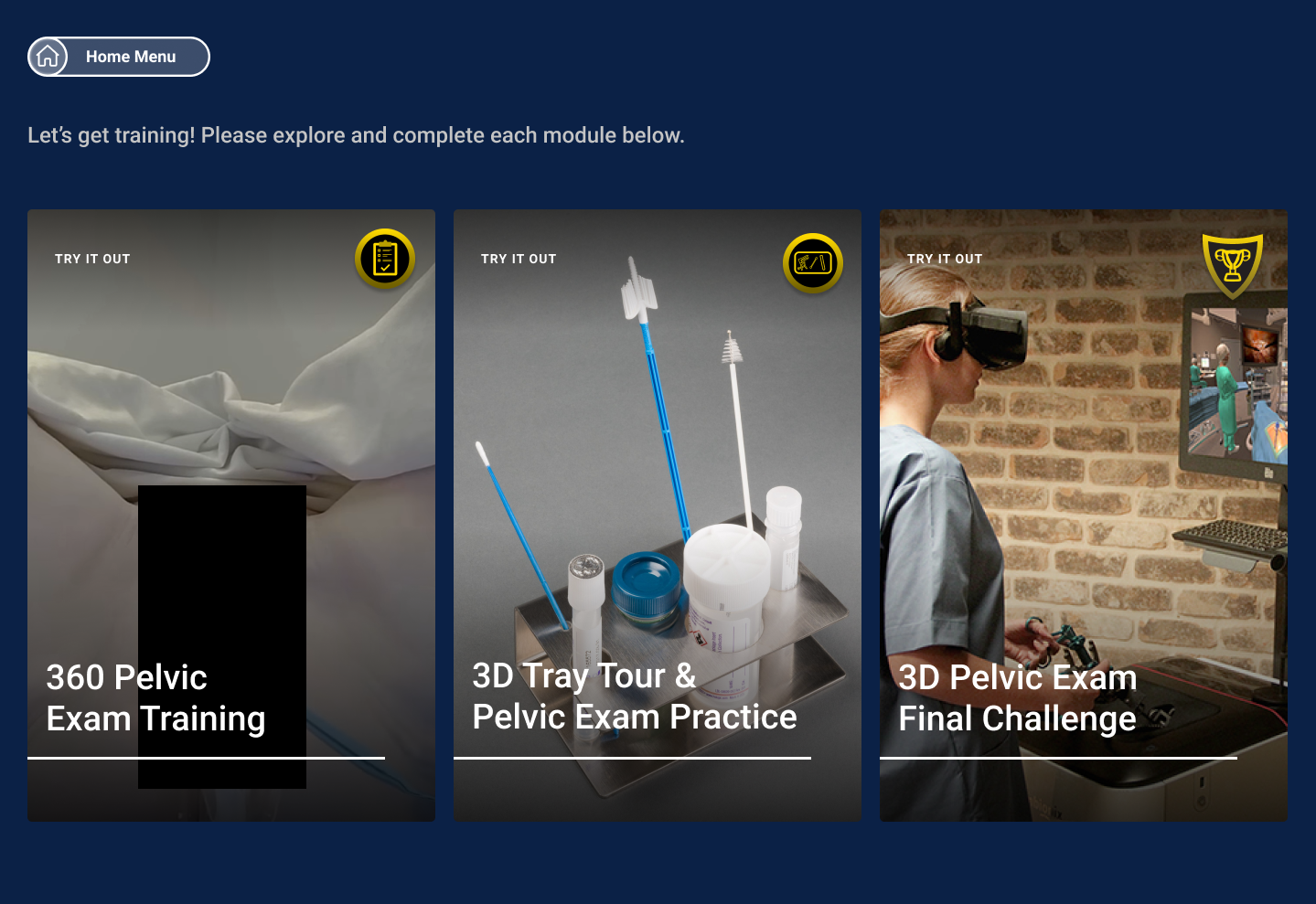
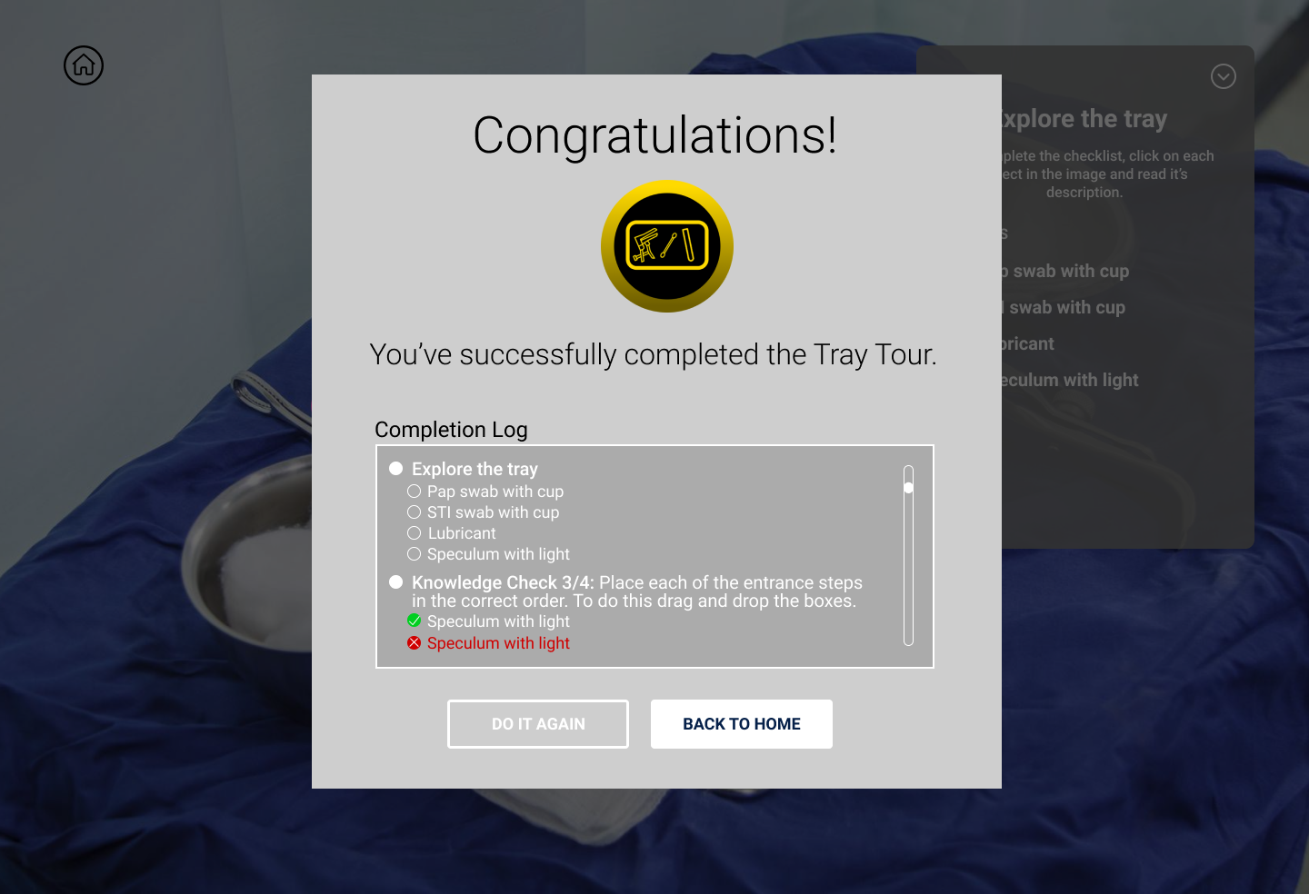
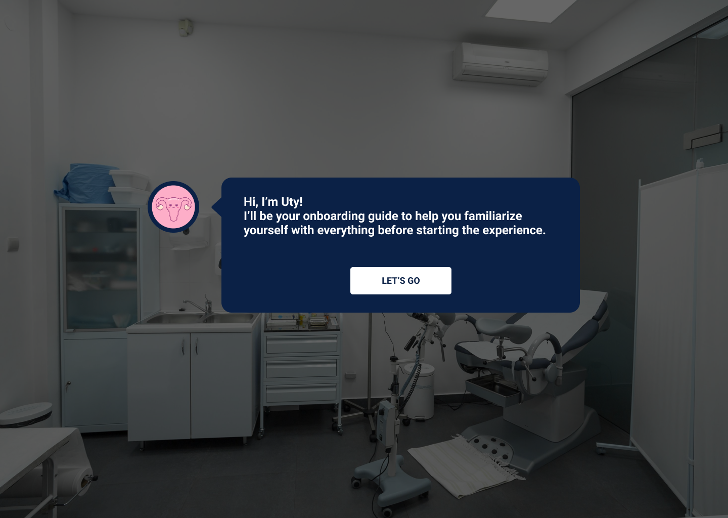
 User Research  |  UI Design  |  Graphic Design

  Team
Tim Kanellitsas        Director of Design
Bryn Christenson    Senior Product Designer
Paul Josel                Junior UX Designer

Overview

As a leader in innovative educational programs, the University of California San Francisco School of Medicine strives to utilize cutting-edge technology to enrich the learning of its students. Virtual reality can be used as an effective medium for education by immersing students in a lifelike scenario that mirrors real world procedures and has been shown to increase both learning comprehension and retention.


The Task

Build a program on desktop and VR that assists aspiring nurses and doctors with learning the tools and practices involved in a routine pelvic exam. The program would be available in virtual reality and on desktop, and would include a 360 degree instructional video, a 3D section for familiarizing with medical tools, and a challenge to test the user’s mastery of the information.


My Role

I was tasked with interviewing pre-med students and defining their wants and needs for the program. I was then responsible for designing an intuitive UI as well as iconography for all clickables and completion badges on the desktop app version of the program. I also designed the virtual reality tablet to contain all the interface elements while in virtual space, and conducted usability tests to further improve the design and level of user satisfaction.

RESEARCH

Understanding the User

To understand why this program was needed as well as to get a feel for who we were building this program for, we interviewed UCSF students to get a better idea of what would make this the best learning experience possible. 

Storyboarding

Following a meeting with UCSF’s Director of Technology Innovation, my design team collaborated to create a storyboard to organize all the required learning materials into a step-by-step document, outlining the user’s journey and features to be showcased in the program.

User Flow

I then created a user flow as a visual representation of the storyboard and to highlight the different types of sections in the program. The flow was modified as improvements to the program were made, such as combining the Tray Tour and Practice modules.

Degrees and Dimensions: A Challenge

On top of being usable on desktop and in virtual reality, this program had to contain 2D screens, 360-degree videos, and interactive 3D segments. Seeing the different formats scattered around the user flow, it became apparent that keeping the designs of the sections cohesive and consistent across the program would prove to be one of the greatest challenges to be faced in this project. With the discovery of this caveat, several design questions arose: 

Is it still possible for one interface to be used across all formats?

How can interactive learning tools be integrated into a non-interactive 360 video?

In a 3D segment on desktop, how can a user look around freely while simultaneously clicking and interacting with objects?

DESIGN

Toolbar

After some experimenting with mockups, it became clear that one interface across the various formats was not a feasible option, as the different sections required buttons and menus specific to their content. 

However, I found that keeping just one UI element consistent across the program’s learning modules would provide the user with a familiar usability tool while still maintaining the flexibility necessary to function well in both 360 and 3D. Thus, the toolbar.


In addition to working in 360 and 3D, the toolbar also solved the issue of seamlessly switching between looking around and clicking in 3D modules by including the camera toggle button.

Initial toolbar sketches.

Main Menu

The user’s hub for selecting a training module. While initially divided into four modules, the program was later condensed into three sections to lessen the amount of times the user was taken out of the training.

Module 1: 360 Exam Training

For the 360 video, I built a layout with which students would immediately be familiar, with many similarities to the interface provided when watching web videos on mobile devices. It includes a play/pause button, timeline, volume control, and the ability to go back or forward 15 seconds.

Module 2: 3D Tray Tour and Practice

For the tray tour module, the user is able to look around an operating tray and interact with medical tools involved in the examination. The left side of the screen becomes a checklist for completing each part of the module.

The notification button on the toolbar now functions as a pop-up, providing the user with instructions and questions, while also being able to be minimized to avoid cluttering the interface. 

Completion Screens

Upon completing a module, a pop-up appears with a badge. The badge would then appear in the corner of the module on the main menu, signifying completion.

Usability Testing and Implementing Feedback

After constructing a working prototype of the program, we let five students give it a test run to see how well the desktop application worked and to receive feedback on what aspects of the program could be improved. Here is a summary of the main takeaways:

Iteration 1: Review Answers

The first and most important improvement to be made was to add a section that allows users to review their answers and optionally go back and review sections where they may have incorrectly answered questions. Since completion screens were already in the program, I suggested adding a review log, where the results from the module are shown. This allows users to see where their knowledge could be improved, and they can click on specific questions to go back to that area of the module. While re-doing questions does not affect a user’s final grade, the review log is an effective tool for further practicing certain sections before trying the module again.

Iteration 2: Instructional Guide

After using the prototypes, several students expressed feeling somewhat lost at certain points in the module where they would forget what they were supposed to be doing. To combat this confusion, my team and I developed an instructional guide, nicknamed Uty, to help students stay on task. She would be introduced in the tutorial section and would be present on the bottom right corner of the screen as tasks were completed.

Iteration 3: Consolidate Modules

Another useful piece of feedback we received was that one user felt as though she was being pulled out of the experience too much.

“It feels like as soon as I come to grips with the controls and start getting into a flow I complete the module and get sent back to the main menu. I wish I could complete the course in one go.”
 
While the thought of stringing all the modules together was an intriguing option, UCSF’s Technology Director was clear in wanting to keep sections distinct from one another. That being said, we were able to combine the 3D Tray Tour and Exam Practice in the hopes that users wouldn’t feel like they were being taken out of the experience too often and could complete the program faster.
 

Iteration 4: Cross-functionality

After completing the desktop prototype, one student remarked that it would be useful to be able to switch between VR and desktop, allowing users to continue working on one platform where they left off with the other. They therefore suggested building a ‘Sign Up/Sign In’ menu at the start of the program. As a simpler solution to creating a new account, my team decided to use the students’ pre-established login credentials from UCSF’s website to allow students to save their progress in our program. This allowed us to skip building a Log In menu and provided a login system that students would already have memorized, minimizing cognitive load.


Iteration 5: Video Quizzes

In the 360 video section, a student had the idea to put the knowledge checks at the end of the segment for more of a challenge. These multiple choice quizzes initially appeared intermittently during the video, but we conducted an A/B test for the section where the initial quiz design was compared to putting all the questions at the end. The latter format was indeed shown to make the module more difficult for students, but the students who completed the new module design were able to answer the questions about the video material in the Final Challenge faster. Therefore, the new format suggested an increase in learning retention compared to the original one.

Virtual Reality

With the desktop version finalized,  it was time to design the program for use in virtual reality. While the interface I had made for desktop functioned well as an overlay on a 2D screen, it is difficult to maintain the same layout in 3D space.

The difference between VR and desktop mockups. The curvature represents the user’s vision and peripherals while in virtual reality, with all the UI elements are nested in an in-module tablet.

Tablet

As an alternative to the 2D interface, I designed a tablet to be used in VR where all interface elements could be placed. 

Some potential candidates for the tablet’s look and layout:

A skeumorphic tablet option, with the appearance of a clipboard commonly found in doctor’s offices.

A tablet with a horizontal orientation, allowing for a better use of space and video instruction. If the user turns their wrist while holding the tablet, it would make the toolbar appear on the wrist, similar to how one would look at a wristwatch in real life.

A straightforward tablet resembling an iPad.

Final Iterations

After being tested in virtual reality, The iPad-ish tablet with the vertical orientation was ultimately chosen after being found to have the most realistic feel. I then consolidated the buttons, menus, and questionnaires from the desktop version and put them in a format that would be legible and easy to interact with within the tablet.

Reflection

With the designs finalized for both versions of the application, the files were sent to the development team and my contribution to the project was completed.

What did I learn from this project?
Keep the user front and center. There were times over the course of this project where I wanted to add some cool features like the VR ‘wristwatch’ toolbar. In hindsight, however, I realize this consideration was rooted in my own desire to make a flashy design rather than one that best suits the user. I learned to be aware of my own thoughts and not let them be prioritized over the needs of the user or the ease of use of the program.

Design with consistency but stay flexible. During the design portion, I became fixated on keeping all the module UIs identical to minimize the cognitive load of users. However, this proved impossible with the differing formats of each module. To this end, I learned that keeping just a few elements consistent, such as the toolbar in this project, can often be enough to keep the user from feeling frustrated or lost.

What can be done in the future?
To further meet students’ needs, more modules can be added to the program. These can include diagnosing symptoms of potential infections, and practicing procedures more specific than just a routine exam. Additionally, an exit survey can be added to the end of the program to get more feedback from users and further improve the app.

Thanks for scrolling!
I hope you enjoyed this project.

Next Case Study: Falling Fig