Paul Josel

 Client
Petroleum Development Oman

Scope
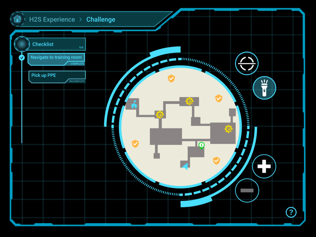
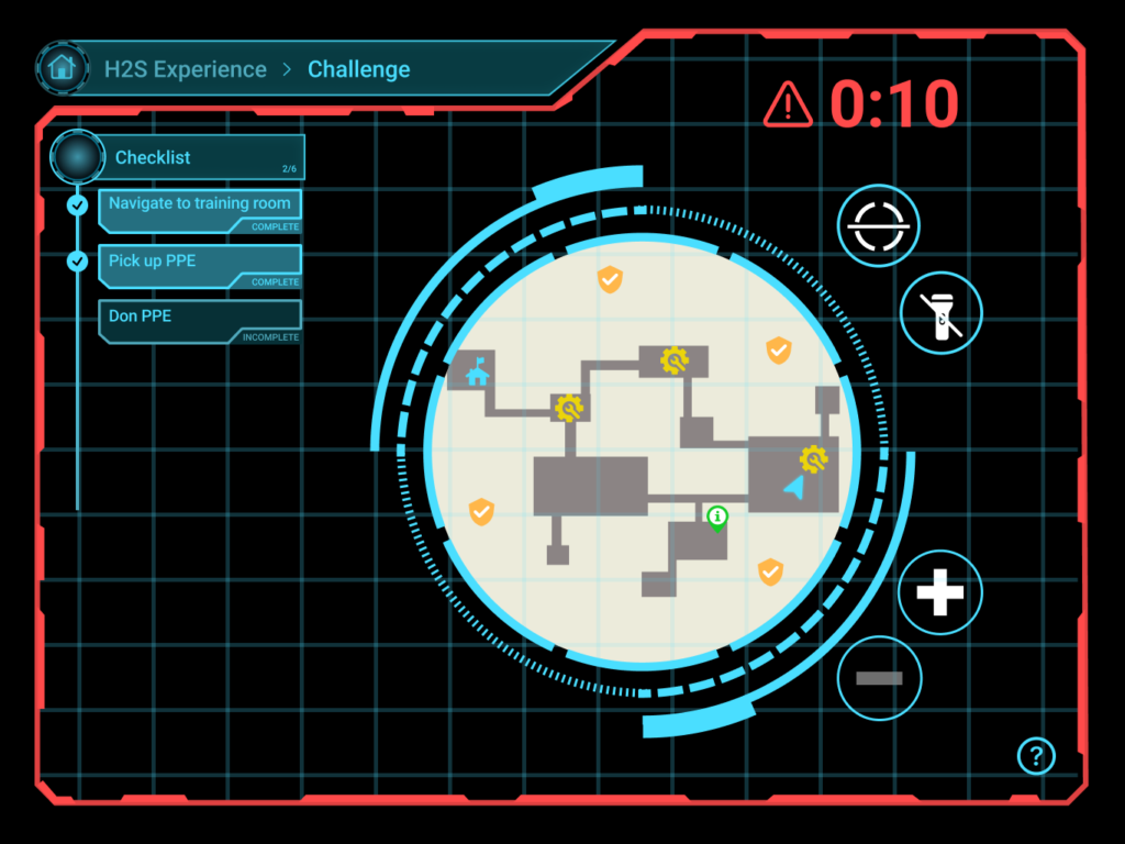
 UI Design | Visual Design | Animation

  Team
Tim Kanellitsas        Director of Design
Bryn Christenson    Senior Product Designer
Paul Josel                Junior UX Designer

Overview

Petroleum Development Oman (PDO) is the largest gas exploration and production company in the Sultanate of Oman. As a company with hundreds of employees who regularly interact with volatile natural gases, it is important that workers are familiar with their environment, equipment, and procedures to ensure that they can be prepared in the event of a potentially life-threatening situation. A realistic VR program, in addition to being more scalable than traditional in-person training courses, offers a tremendous benefit to the safety of construction site employees by providing them hands-on experience with site operations before ever setting foot on it.


The Task

Create a VR training program that increases employee preparedness in an emergency. We were commissioned to make a simulation that helps site employees become familiar with two scenarios in which accidents were most likely to occur: confined spaces and sudden exposure to hazardous gases. This includes testing users on site procedures, donning respiratory protective equipment (RPE), and executing emergency evacuation plans.


My Role

For this project, I designed the homepage and collaborated with a senior designer to create all the UI elements in the project. I also designed the screens for several challenges and delivered animations for the development team to replicate when building the program in Unity.

RESEARCH

Stakeholder Interviews

Communicating with PDO’s representatives, we were able to align business goals and identify the key features that had to be included in the program to achieve them.

Primary Business Goals:

  • Increase worker safety and minimize risk of injury to any personnel
  • Employees will have proven knowledge of contingency plans
  • Employees will be familiar with equipment prior to going on-site

Key Features:

Sections

  • Module selection menu
  • VR tutorial
  • Explore/Free practice section
  • Equipment identification section and test
  • Donning PPE training section
  • Final Challenge (emergency scenario)

UI Tools

  • Map
  • Scanner (object identification)
  • Checklist of objectives
  • Description section for equipment
  • Help button
  • Countdown timer for timed challenges

Competition

I conducted a brief competitive analysis using metrics based on the takeaways from our initial meeting with PDO. While several companies offered virtual reality training programs, none were built specifically to fit the needs of individual clientele.

Personas

I also created personas based on employee demographic information provided by PDO.

While designing the program, it was important to remember that there would be employees who would welcome a new cutting edge training solution…


..and others who, well, wouldn’t. Throughout the design process, these personas served as reminders that this would be a new experience for most of PDO’s employees. There would be those who were less technologically inclined but should still be made to feel confident in adopting the new training system.

Storyboards

With the company goals and users in mind, we built a high level and granular storyboard to encapsulate all the sections and screens that would be required.

High level: A walkthrough of our proposed program, this was used as a tool to communicate our vision to the representatives of PDO.

Granular: This detail oriented storyboard was used as an alignment tool to highlight every step of the program and ensure the design and development teams stayed on the same page throughout the process. 

User Flow

I then created a user flow to accompany the high level storyboard.

DESIGN

Sketches

Sketching allowed me to quickly draw up different versions of the homepage and the in-module tablet. Per usual, the simpler designs were the most popular for the homepage and were selected to make first time VR users’ experiences more intuitive.

As for the tablet, drawing a few iterations let me see how many UI instruments I could fit into a single screen, as well as how to lay them out in a cohesive way that would require minimal thought processing in order to keep the user immersed while completing tasks.

Homepage

Early iterations of the homepage featured a wraparound background and hard, colored borders for clickable elements, in addition to a full screen interface. After testing it in VR, however, the background and borders felt harsh. Therefore, I decided to ditch the electric blue outlines and background, reduced the amount of clickables, and added a two-column layout for a more organized design.

Tutorial

From research within the company, it was found that 88% of the potential users of the training solution had never used a VR headset before. Therefore, we created a tutorial that gave a succinct explanation of the hardware and controls, as well as a Sign Up portion so users could create a profile to save their progress.


I chose to keep the interface consistent with the main menu to minimize confusion and keep the user from feeling stuck if they had wrongly clicked on the tutorial.


A spoken voice guide was also included in the tutorial, keeping the amount of written text to a minimum.

Tablet

The final designs for the tablet in virtual reality.

Module Selection

At the client’s request, we designed the in-module tablet with a futuristic aesthetic. The neon blue adds a sharp contrast between the tablet and the surrounding training environment, which was mostly sand colored.

Module Start

Each module begins with a synopsis and a video detailing what to expect of tasks.

Scanner

The scanner was built with a semi-transparent background, allowing the user to have an easier time centering an object of interest within the scanning circle.

Map

I had initially built the map to have a square border in order to maximize space visibility, but it was later changed to a circle in order to be able to fit the checklist, buttons, and to keep the design consistent with the scanner from the other modules.

Timed Challenges

Certain objectives had time limits, so for these sections I inserted a pulsing red outline and a timer, making it clear to the user that they were under new constraints.

Animations

After the final designs had been created, I was also tasked with building animations in order to communicate to the development team precisely how the interface should appear in virtual reality, achieved through Adobe After Effects. Check out a few key examples below:

Opening animation

Main Menu transition

Countdown and module start

Object scan

Module completion and challenge unlock

Implementation

Finally, here are some clips from the first presentation to the client. While the program is still rough around the edges in these videos, you can see the final designs of the tablet and tutorial in action. 

Map and navigation

Object scan

Countdown timer

Tutorial

Previous Case Study: NexGenT

Thanks for scrolling!
I hope you enjoyed this project.