Paul Josel

 Client
NexGenT

Scope
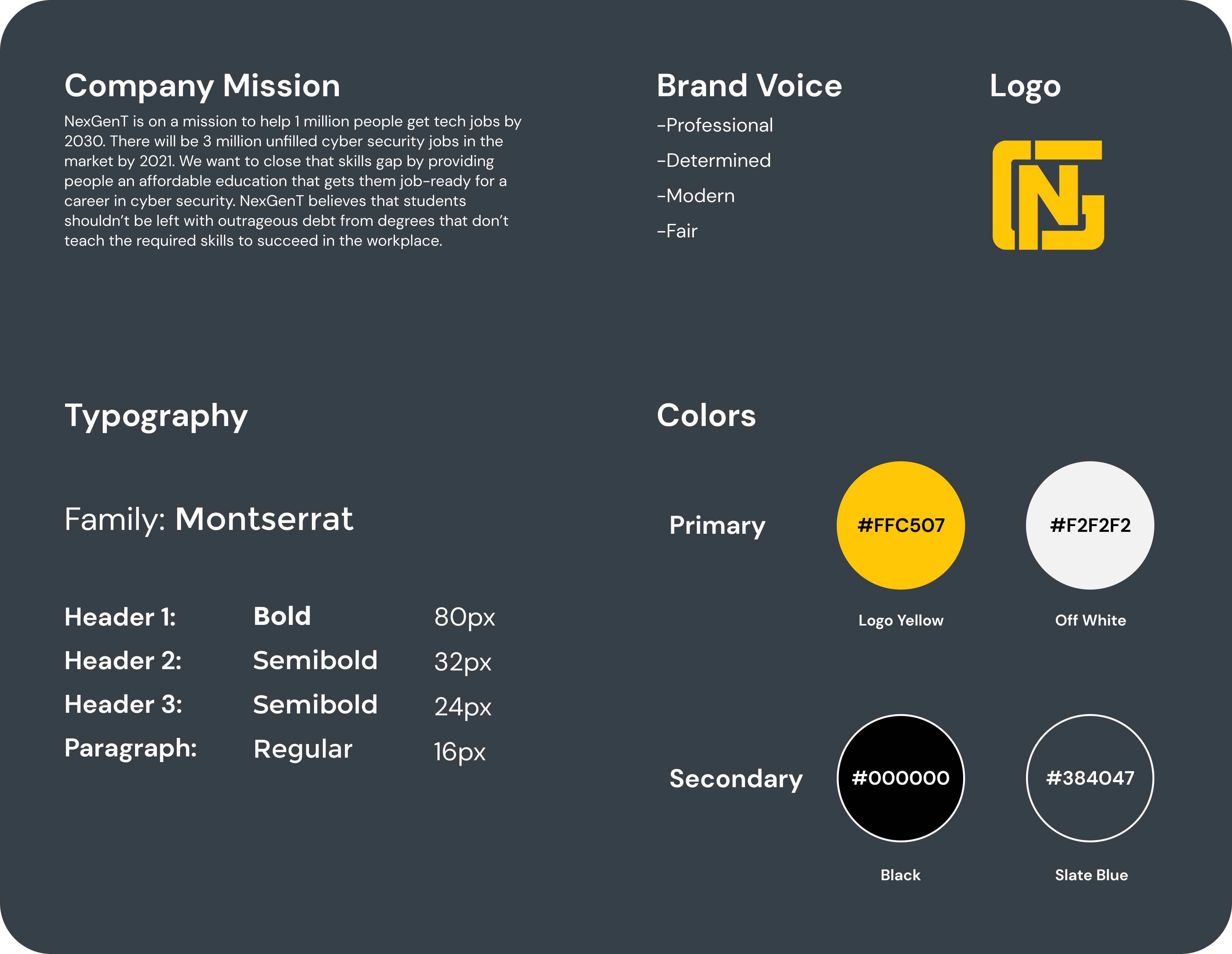
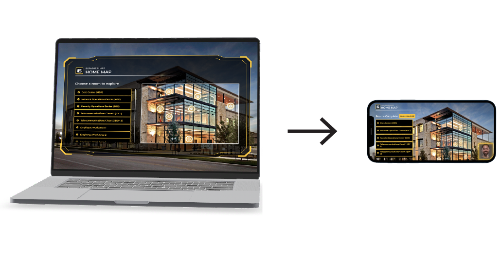
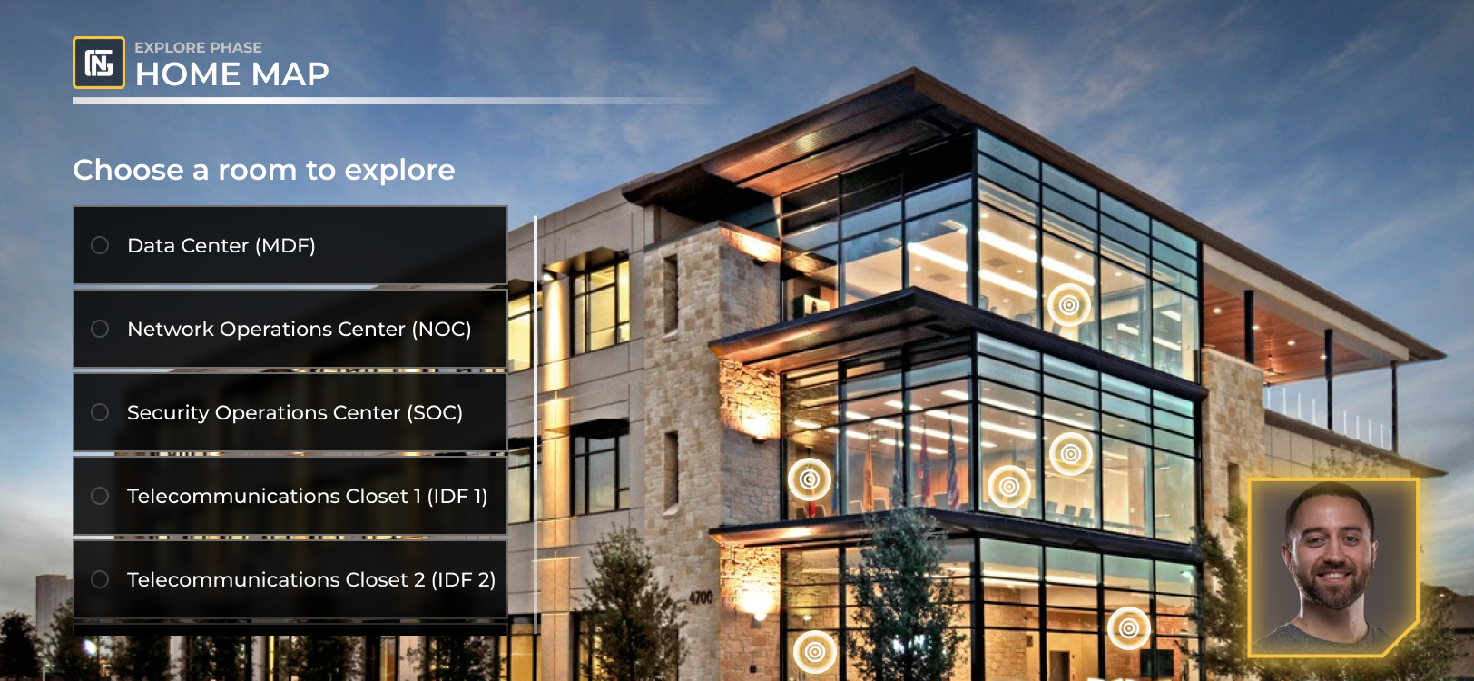
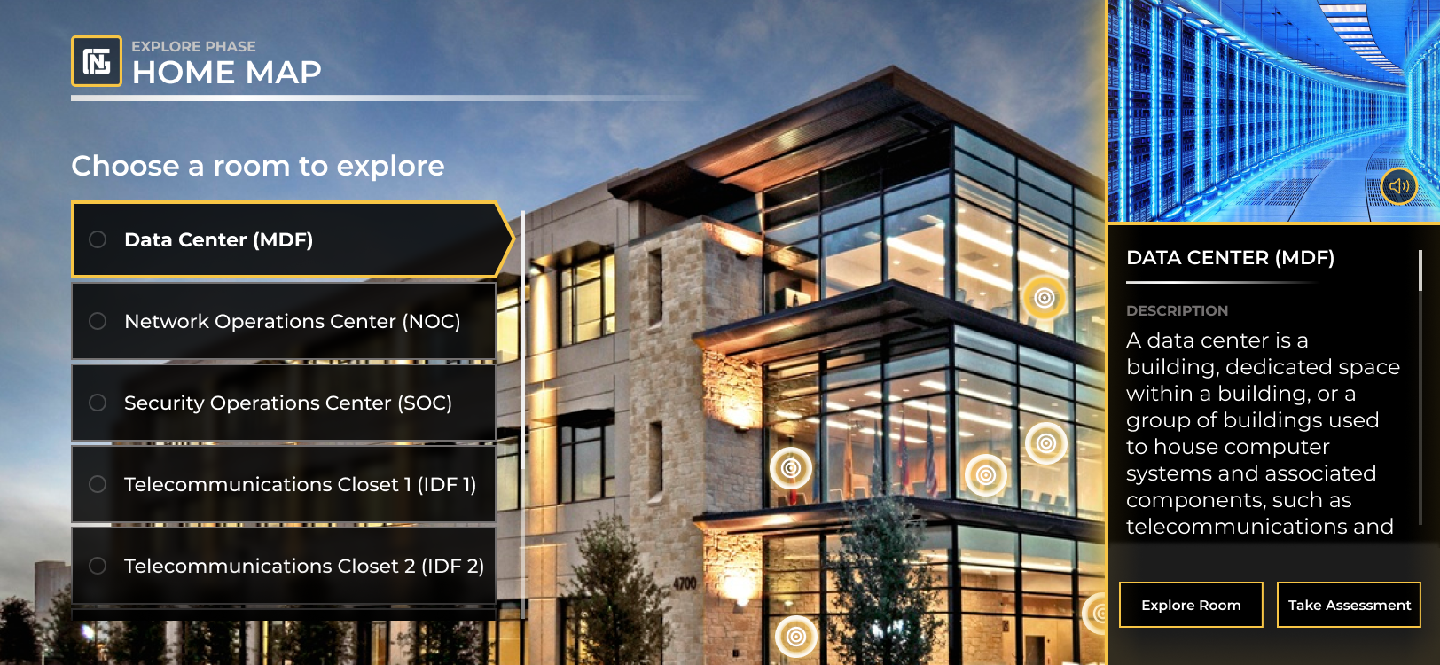
 Design System | UI Design | Interaction Design

  Team
Tim Kanellitsas        Creative Director
Bryn Christenson    Product Designer
Paul Josel                UI Designer

Overview

NexGenT is the #1 network engineer and cyber security training program in the United States. The company’s goal is to provide a comprehensive education in IT for prospective network engineers, systems administrators, and security specialists. To aid in building the most effective program possible, NGT hired our agency to build a segment of their training bootcamp, involving the identification of areas and devices associated with IT jobs.


The Task

Build a module that assists IT professionals in learning the objects and tools required in network engineering. The user will be guided through data centers and other work areas, familiarizing themselves with the items as they go. They are then challenged to recall the function of these items in a later challenge. The module will be available on virtual reality platforms, as a desktop application, and in a mobile format.


My Role

Using NGT’s branding, I designed all the in-module UI and visual elements of the program.

Note: In this case study I will focus primarily on the design and development of the mobile version of the program. For studies involving VR and desktop, I recommend viewing the UCSF and PDO projects.


Storyboard

Using the information taken from a discussion with one of NGT’s founders, we built a storyboard outlining each screen, feature, and user ability to be included in the app.


User Flow

An outline of the app’s architecture and UI features to accompany each screen. The user should first complete the Explore Phase to get a grasp of the app’s teaching material, followed by the Assessment to test their knowledge, and finally the Challenge Phase to complete the program.

DESIGN

Wireframes

Understanding the features to be included on each page, I rapidly sketched and built up wireframes of the main screens’ interfaces.

Design System

After discussing the wireframes with my team and with a solid concept of how we wanted the app to look, I built a design system of reusable UI components for the desktop and mobile versions of the program. This dramatically increased the consistency and speed of development for the app.

Style Guide

I also developed an accompanying style guide that is inspired by the NGT website color scheme and typography.

Mobile UI

While the VR and desktop formats may provide a more immersive learning experience, the addition of the mobile app allows users a convenient alternative if they do not have access to a VR headset or computer, or just want to continue their training on the go. 

It was important to build the mobile app with the same depth of learning as the other platforms, albeit with modified UI allowing information to fit cleanly on a phone screen and utilize the control options available on smartphones, such as tapping and scrolling using a finger.

To keep the design as consistent as possible between platforms, the mobile app was built entirely in a horizontal orientation.

Welcome Screen

Upon opening the app, the user is greeted with the option to get a tutorial narrated by NGT founder Jacob Hess. Since some users will have likely already used the desktop or VR version, I added the ability to skip the onboarding process.

Explore Phase

Upon continuing through or skipping past the onboarding, the user is dropped straight into the Explore Phase. 

Early prototypes had a main menu where the user can choose a section to study, but it was found that users had better results in the version in which the entire program was completed linearly, with sections completed one after another instead of taking the user back to the menu. Therefore, the main menu was scrapped. 

In the home map, users are presented a list of rooms to explore along with an image of the facility. The user can then choose a selection from the list or tap one of the corresponding nodes on the image to open a description and purpose of the room, along with the options to explore or to take the assessment immediately.

NGT founder Jacob Hess appears intermittently on the bottom right corner of the screen throughout the program to verbally instruct and guide users.  

Exploring Rooms

After choosing to explore a room, all the items in the room are shown on the left in a collapsible menu. The user can look around by sliding a finger left and right and can move to different perspectives in this room by tapping the icons on the floor. Depending on the user’s position, the white nodes can be tapped to take a look at the items in the room. Alternatively, the user can tap a selection on the list to be taken straight to the item.

When Jacob is not instructing the user, the bottom right corner becomes a button that re-opens the home map, allowing users to move between rooms.


Tapping one of the nodes will bring the user to a different view of a part of the room. Here, they can tap on the nodes to bring up an image and description of one of the items.

After tapping an item, the item description will appear for the user to study. One can also choose to hear a verbal description to skip the scrolling.

Assessment

After locating every item, the manager will appear instructing the user that they are ready to begin the timed assessment. 

There is one assessment per room. The assessment has the same interface as the Explore Phase, except that the user must find the correct item based on the description in a set amount of time. 

Upon completing the assessment, the user can see their final score, as well as a dropdown to review their answers.

Challenge

When the assessments for every room have been completed, the Challenge Phase can be attempted. 

In this final task, the user is given object names that can be from any room throughout the training facility. The user must successfully find the majority of the objects within thirty minutes in order to pass. 

To make room for the object list, the list of rooms is replaced. The user can still navigate from room to room by tapping the nodes on the image.

After successfully (or unsuccessfully) finding the object, the ring around the object’s icon will change color.

Upon completion of the final challenge, the user is shown their results and the manager congratulates them on mastering the program.

Conclusion

The designs were approved by the clients and were then shipped to the development team for completion of the app. 

For future steps in enhancing the effectiveness of the module, the retention rate from this learning program should be monitored to see if there are any potential improvements. Exit surveys can also be implemented to track trainees’ confidence, breadth of knowledge, and levels of satisfaction after having completed the program.
Previous Case Study: Falling Fig

Thanks for scrolling!
I hope you enjoyed this project.

Next Case Study: Petrol Development Oman